Virtual cards and mobile payments are all very cool, but physical payment cards are here to stay. And when you are issuing your own card, you want it to be superior to others : more elegant, more interesting, in style. The question is — is it really possible and what do you need to know at the start? Vlad Kovin, designer of Bilderlings, shares his experience in working on the design and issuance of a payment card.
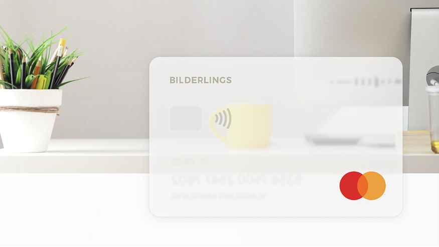
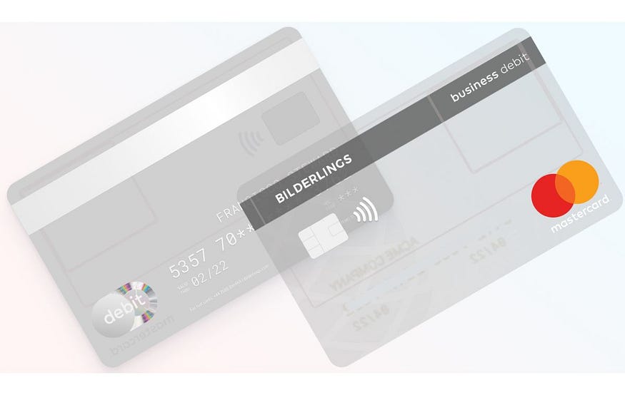
The challenge was to create a fully transparent card with practically no elements on it. As a result we got a black magnetic strip, a big chip, and dark plastic, but the design turned out to be almost like the competitors’. However, we still consider it to be a victory.
The idea: Transparency is the new black
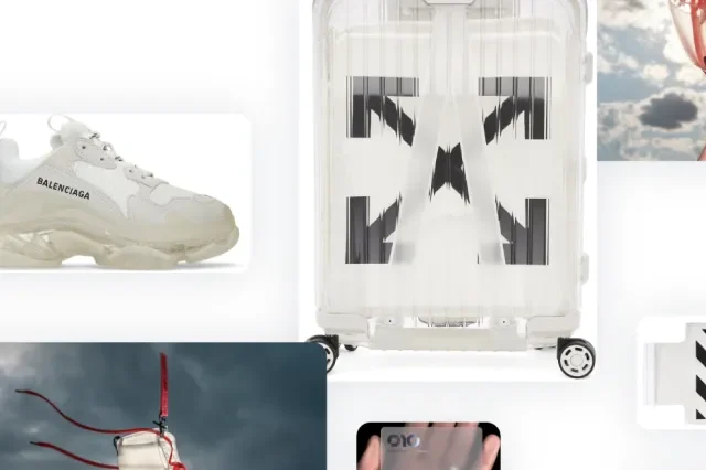
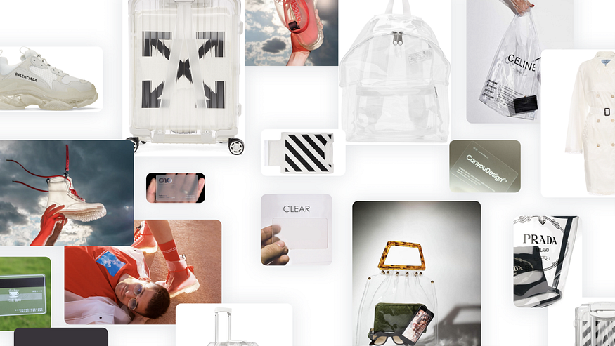
I noticed the trend for transparency in the fashion industry — transparent shoes and transparent coats. This theme harmoniously fit the idea of financial transparency and allowed us to further develop an interesting visual concept of the product.
First I created this mood board.
Then came the first sketch of the card: light transparent plastic, without a magnetic stripe, with a small chip, and a minimalist logo.
And then we faced reality.
Logo and Hologram
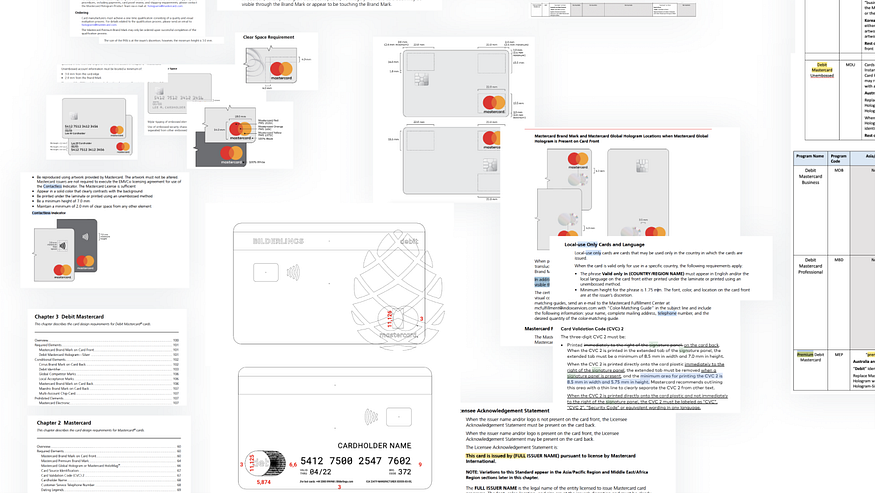
The Mastercard payment system has everything spelled out in the minutest details: all the shifts, graphics (holograms, Mastercard logos, icons for contactless payments, etc.), and the minimum sizes that can be used in the card design. These rules depend on the type of card product, the region where it will be issued, and the territory where it will be used. The rules change, so each year, there are more opportunities to create more interesting card designs.
In 2018, Mastercard updated its design requirements, making it permissible to use their logo without text (i.e., without the word “Mastercard” itself — just the two circles). We aimed for a minimal number of elements on the card, so we were counting on this ‘wordless’ logo. We aimed for the minimum number of elements on the card and would have used this ‘wordless’ logo, except for 2 ‘buts’.
Firstly, since the card is transparent, all elements printed on one side are visible on the other. Then we came up with the idea that we could align the Mastercard logo, the one of which is on one side of the card, with the hologram on the other — their sizes almost match and they could cover each other.
But then we encountered another problem: the new “wordless” logo in the Mastercard guideline had different shift requirements — it was positioned a bit lower, and then the hologram would protrude significantly. And we can’t make the hologram larger or smaller, higher or lower: it’s manufactured in a special factory of authorized producers. Therefore, to have the logo cover the hologram and be positioned higher, we had to use the old one.
Working on the design of payment cards is a matter of a million compromises that need to be made in order to fit into all the guidelines without ending up with something that’s outright bad.
Magnetic Stripe
There’s no information in the Mastercard guidelines that the magnetic stripe on the back of the card has to be black. You can only find out that it has to be black and only black, only by asking the manufacturing company. Mastercard offers the option to issue a card without a magnetic stripe — this became possible recently and its introduction was very pleasing to us. However, later it turned out that a card without a magnetic stripe comes with limitations for clients: this card is only valid in Europe (it even has “Europe Only” written on it). This single black stripe changes the look of the card so much that we seriously considered why not to issue a Special Edition for the EU only. But, of course, we reconsidered: it would have been difficult to explain to the customer that for aesthetic reasons, he would need to carry two pieces of plastic.
Chip
I wanted to minimize everything and make a small chip. But during the manufacturing process, it turned out to be that a transparent card has a different configuration — the antenna for contactless payment uses fewer layers of wire, but the chip itself is larger. Alright, we accepted the chip and moved on.
Plastic
And I wanted a light plastic. But as we got down to business, the manufacturer informed us that such an option doesn’t exist at all. Some ATM models might simply “not see” the card if it’s completely transparent. Thats’ why, only tinted plastic is used in the production of transparent cards. As you’ve guessed, we found out this only during the manufacturing process.
Font and Laser Power
The name, surname of the owner, and the card number are referred to as “personalization.” So, there are several methods of applying personalization — by laser, embossing (indentation), or thermal printing with a layer of varnish on top. Mastercard has many restrictions for embossing, and if you use laser, it’s almost entirely up to your taste: only the minimum font size and minimum permissible shifts are specified. And you can choose the fonts yourself.
We chose laser personalization — it looks more elegant, less flashy. To ensure that the personalization doesn’t stand out against the other elements, we wanted to make it much lighter than usual. To achieve this, it was necessary to correctly select the laser power — it was affecting the texture, to which extent the text will be raised, as well as the intensity of the color.
But during production, for some reason, the cards were printed not as per the design but by feel. They used either the wrong font or the wrong size. And the card number also had to align with the edges of the personal data text. In the end, it took about 20 cards for the manufacturer to match all the details with the design.

Alignment and Text Edges
Here’s another nuance: ideally, all elements on the card should be aligned along one line. But during the production, the card’s expiration date and the fine explanatory text got misaligned. And this couldn’t be corrected. The thing is, all cards are printed on one large plastic sheet — there are many of them at once. Then, all the standard text (which is the same for all, not personalized) is applied to this giant sheet. And only after that this sheet is cut into individual cards. The cuts are not perfectly even — sometimes, everything shifts slightly. And the machines that apply personalization are already calibrated. So if a card shifts even a little bit, then what is printed on it shifts as well. There’s no getting away from this.
We decided against the signature field
Here we were lucky: Mastercard started to allow not to use signatures. Initially, we planned to include a matte section on the card where the client could sign with a special marker (which would be provided with the card). But in the end, it wasn’t necessary.
We maximally “cleared” the front side of the card
We think that the front side of most manufacturers’ payment cards suffers from an excess of symbols. We tried to leave a minimum of elements there, transferring personal data to the back side. As a result, the card looks neater, its surface plays with light rather than being cluttered with an abundance of data. The front side has become more like a “cover”. This approach made the company logo stand out rather than getting lost among other details.
Conclusions
We should make the world a better place. If you suddenly find yourself responsible for the design of plastic payment cards, remember: the more people strive to be thoughtful, meticulous, and attentive, the less mediocrity there will be in the market. Payment systems (like Mastercard and others) surely track the demand for changes, so if everyone aim to do well and beautifully, then, perhaps, the requirements of payment systems will become more flexible for elegant design.
All transparent cards look alike. In the end, our card turned out to be similar to a card of another bank — although, naturally, this was not intended. As the project progressed, it became clear why some elements are made in a particular way — it’s the only possible method under the current conditions: all transparent cards today will look similar to each other. Because everything that unites them is mandatory. Otherwise, it simply will not be possible to be manufactured.
But they can differ by the degree of meticulousness. In these conditions, making a card’s design unique is only possible by refining the details — being thorough, striving for maximum neatness, and thinking through everything down to the smallest detail.
The appearance of a plastic card is influenced not only by what is in the Mastercard “talmud”. . It’s better to discuss all the details with the manufacturer right away, asking even what may seem like the most obvious questions. This will save you time in the long run.
The manufacturer is not Copperfield. Expect inaccuracies, minor flaws, and, as a result, the need for revisions. Allocate extra time for this in the project schedule to avoid disappointing customer expectations.